

‘Juno’ is a pregnancy app designed for pregnant women in Ontario going through a low-risk pregnancy and not receiving proper care from their OBGYN.
With this app, soon-to-be mothers can access extra care by selecting an available OBGYN/midwife and contacting them by text or setting up a phone-call appointment. This way, they can get their concerns addressed in a short period of time.
They will also be able to go through medical-reviewed articles about pregnancy, post-partum and baby care, find a community of pregnant women and create meaningful connections.


OVERVIEW
During Brainstation’s UX Design Diploma Program, the most important project we had to work on was an individual capstone project that we had to develop throughout most of the program schedule. We were free to research, select a problem space, and build a unique digital solution. We had strict deadlines and instructions to guide us through the project work.
Tools
Figma, Invision, Adobe CC, Procreate
Timeline
Jun - Dec 2022
Platform
Mobile IOS
Role
UI/UX Designer
Project
Individual Capstone
BACKSTORY
‘Juno” is born from a personal experience. I went through pregnancy and delivered a baby boy in October 2021. Throughout my pregnancy, I felt constatly anxious and alone; OBGYNs are not available outside appointment hours, and in-person appointments are very few and rushed. This caused me to be often worried about my pregnancy and not be able to get any help when needed.
I was very excited to work on this project, get a better understanding of the problem space and collect more facts and experiences that confirmed my assumptions.
PROCESS
Primary and Secondary Research, Competitive Analysis, User Interviews
Research
User Persona, Experience Map, User Stories
Define
Brainstorm, Inspiration, Task Flow, Sketching
Ideate
Wireframes, Lo-Fi Prototype
Prototype
Usability Testing
Test
Hi-Fi Prototype, More Testing, Next Steps
Final
HYPOTHESIS STATEMENT
I believe that creating a platform for pregnant women where they can text and chat with available OBGYNs and midwives anytime they have a question or concern, be part of a community and explore/share pregnancy-related articles and news will improve the experience of women going through their pregnancy and help fill the gaps existing in the OBGYNs’ care services.
I will know this is true when 8 out of 10 pregnant women will confirm that their worries and anxiety during their pregnancy has decreased by 80% and the app “Juno” has given them great peace of mind.
PRIMARY AND SECONDARY RESEARCH
OBGYNs are specialized doctors and primary medical professionals caring for pregnant women. Their practices are very busy as they follow multiple pregnancies simultaneously. The significant work volume causes them to rush through appointments and reserve most of their time for women with high-risk pregnancies.
The result is that women with low-risk pregnancies cannot address all of their questions and concerns and are too often worried about their baby’s health.

59.1%
of pregnant women in Ontario are in the care of an OBGYN
The Canadian Maternity Experiences Survey. Ottawa, 2009.
DESIGN CHALLENGE
How might we help pregnant women cared for by an OBGYN address their questions and concerns to a professional and be better heard?
USER INTERVIEW INSIGHT
KEY PLAYERS
Pregnant women in Ontario cared by an OBGYN with low-risk pregnancy
“The appointments are so rushed I hardly have any time left to ask questions; I never even got to have a nice “sitting down” talk with the OBGYN to talk about the do’s and don’ts of pregnancy. “
“Throughout my pregnancy I only had 4 in-person appointments, and I could never book extra appointments or reach the doctor over the phone. Completely unaccessible. Felt almost like I had no doctor.”
MAIN PAIN POINTS

Impossible to reach OBGYN outside appointment hours

Very few appointments and no extra bookings available

Long waiting times and rushed appointments
PERSONA & EXPERIENCE MAP
At this point of the research, I created a persona and experience map in order to craft designs for the target users and identify opportunties in which to focus a digital solution.


JOURNEY TO THE TASK FLOW
Of all the themes and insights, "hard-to-reach doctor and concerns not addressed" stood out with all interviewees expressing that they expected their OBGYN to closely follow them in their pregnancy journey and be available outside appointment hours.
THEME
Hard to reach doctor and concerns not addressed
CORE EPIC
Select Doctor
Request Appointment
Send Message
SAMPLE USER STORIES
As a pregnant woman, I want to reach an OBGYN easily, so that I can ask any questions I have.
As a pregnant woman, I want to be able to text an OBGYN anytime, so that I can get answers fast.
As a pregnant woman, I want to be able to set phone call appointments with an OBGYN on short notice, so that I don’t have to wait for the next in-person appointment.
As a pregnant woman, I want to connect with an OBGYN outside appointment times, so that I can discuss any concerns I have.
As a pregnant woman, I want to get a list of available OBGYNs, so that I can easily find one to contact.
As a pregnant woman, I want to be able to share my concerns as soon as possible with an OBGYN, so that I can stop overthinking what could be wrong.

TASK FLOW
Based on my persona's pain points and goals, this task flow will successfully help Cristina find a doctor of her preference, connect with them via text message and request a phone call appointment to be able to ask any questions or concerns she has and finally enjoy her pregnancy worry-free.
EXPLORING THE SOLUTION
To develop app features and UI components that best execute the solution, I sourced inspiration from existing digital products such as pregnancy, wellness and great UI apps ( “what to expect,” “Peanut,” “Airbnb” ). I explored a range of ideas and finalized the following top solution sketches.
SKETCHES


APPOINTMENTS
INBOX


CHAT
USER PROFILE


DOCTOR’S LIST
LOG-IN
BOOKING
DOCTOR’S PROFILE
BOOKING DETAILS
CONFIRM DETAILS
App content is divided into categories all accessible from the top bar for easy navigation.

Bottom navigation bar to move around the app pages ( home, saved, appointments and profile).

Doctor’s profile contains information regarding doctor’s experience and qualifications.

Appointment page shows both new and old appointments.

GREYSCALE WIREFRAMES
Once I finalize the paper sketches, I moved onto creating the first set of digital wireframes and the first prototype.


USABILITY TESTING
I conducted 2 rounds of usability testing with a total of 10 users to obtain feedback. I developed a user test script and a set of design appropriate tasks to ensure the app is working as intended.
There were no major issues with the overall basic funcionality of the app, but there were some areas that needed improvement to make the user experience smoother and to take the user interface of the app to the next level.
MAIN ISSUES
“Time selection very hard to understand, overall appointment request not smooth and hard to navigate.”
“Too many CTAs buttons on the same small pop-up screen, not well organized.”
“Remove unnecessary shapes and contours; it can be confusing.”
“Adjust sizes and shapes based on importance and usage.”
Given the time restraints set by Brainstation, I couldn’t tackle all the issues during my low-fidelity stage, so I made further significant changes during the high-fidelity phase. I also conducted a few more usability tests to get additional feedback and ensure the new changes were working and improving the overall app functionality and look.
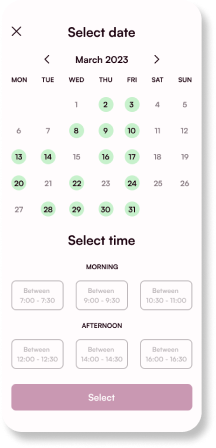


I changed the whole interface of the calendar by doing more inspiration research and based on additional feedback I received. I made an all-in-one calendar dates and times, organizing it in its own page, and the pop-up feature will only be for the confirmation and success recap.
UI AND BRAND DEVELOPMENT
INSPIRATION
Keeping in mind who my target users are, I started gathering inspiration by collecting images that reflected the values that I planned for the app to give: kindness, nurturing and minimalistic. I then developed a colour palette, created a typography library and built a complete design system.


COLOUR PALETTE
Primary & Secondary

Neutrals & Functionals


Success & Error

TYPOGRAPHY

LOGO AND IDENTITY
For my logo, I wanted to represent the core value and the app's primary benefit: other helping hands to pregnant women in need. I got my inspiration from the following picture.

From here, I designed an icon representing “hands on pregnant belly” and iterated different color combinations.
I changed the colors of the hands, and background.


I tried adding the round shape in the middle to represent the pregnant belly.


Experimenting with different colors I finalized the design for the application icon.

After selecting the font, size, weight of the wordmark, I started the iteration process for colors and outline.


MARKETING WEBSITE
At this point in the project, I created a marketing website to promote my app, “Juno.” My main focus was building a strong message about the app’s central values and features. I started by creating the desktop version and then moved on to building the mobile version.


HIGH FIDELITY PROTOTYPE
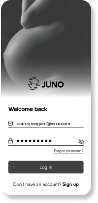
Here is the final design and prototype of my project, "Juno."
I am fully aware that nothing is "final" or "perfect," and there is always room for improvement and generating new and better ideas; that's one thing I love about design!

TRANSLATION INTO ALTERNATE PLATFORM: DESKTOP
I expanded “Juno” into the next most used technology that will most often be used for the navigation of this app: the laptop. I believe that a pregnant woman will often desire to use this app on her computer to have a bigger and better view of articles and to communicate with the doctor more comfortably.


FUTURE THINKING
Although medicine is one of the practices that must evaluate patients in person, the last two years of the pandemic taught us that life as we know it can change in a blink of an eye. It directed us to find more digital solutions to everyday problems and to revolutionize the world through technology. Even though we must visit the doctor in person and have physical tests done to assess our health, we still need a digital and remote alternative to reach the doctor and be heard and helped. The benefit of an app like “Juno” will be helpful not only in case of emergencies like the pandemic but for everyday issues, like having just a small concern and wanting to get a quick explanation, not being able to reach our doctor and needing to find another one available, and so on. I believe that an app like “Juno” will be the future of our society if used earnestly and mindfully.
NEXT STEPS
Expanding and improving features
The app could be expanded so its benefits can reach every country worldwide.
More features can be added, like video call appointments and get more doctors involved. A donation feature could be added to encourage users ( who have the means ) to make donations that will be devolved 100% to doctors and hospitals.
Most important, accessibility feature will be implemented to make the app “Juno” accessible to everyone.
Usability testing
Multiple usability testing and further research must be conducted to ensure the app's usability from the user's perspective.
It is necessary to ensure that each task/page is not challenging to accomplish/read/follow by any user and to make the main app's feature easy and smooth to navigate.
KEY LEARNINGS
Getting user feedback will be your best friend in this field. It doesn’t matter how much you” love” your design and how great your solution looks to you; if it doesn’t get a good response from the user testing, it will not work.
This is the most important lesson I learnt: we need to put aside our ego and be completely open-minded ( and open ears) towards what the clients and users want and need; this way, we will be able to create a successful digital product.
Thank you for taking the time to go through my case study, I hope you find it interesting and feel free to connect with me through email or linkedin.
More projects to come soon!

Asset Credits: Icons - Iconify, Feather Icons, Flaticon | Photos - Unsplash, Pexels | Mockups - Mockup