Overview
Problem
The law firm's website design is outdated, the navigation is confusing, and it’s difficult for the user to find what they are looking for.
Outcome
Visually appealing and highly functional website design that not only stands out but also helps to attract and retain new clients.
Client
Chetan Anand and Associates
Role
UX/UI designer
Understanding the problem.
When it comes to finding a good lawyer to help with legal issues like divorce or immigration, it can be overwhelming to sift through the many qualified options out there. That's why many people turn to law firm websites to get a sense of a lawyer's practice and history before even picking up the phone.
A user-friendly, visually pleasing and efficient website is key to attracting and retaining potential clients. In fact, studies show that if a potential client becomes frustrated or displeased with a website, there's a 93% chance they'll move on to another law firm.
Understanding the current experience
“When I visited Chetan Anand’s website, I didn’t find any important information. There was very little representation of the firm and its lawyers, and the overall look of the website didn’t match their qualifications. If I were a potential new client, I would not even consider contacting them due to their lack of credibility. I was unable to gather any meaningful information about their practice or previous case experience.”
Navin G.
Current client of the firm, when conducting a usability testing of the current website.
It currently lacks a clear structure and has multiple menus that can make the user experience confusing. Also not offering options to learn more about the firm.
The palette is poorly chosen and the colours clash with each other, making it difficult to focus on the content.
No content informing about the firm practices and expertise, no bio of the lawyers and past work experience.
Current content (pictures) do not inspire professionalism and trust.
HYPOTHESIS
By improving the overall website design and navigation, adding content and creating an effective and efficient way to communicate the law firm most valuable information, users will be able to gain important insights of the firm expertise and will feel confident to contact them and become new clients.
Process
User interviews
Comparative analysis
Site map
Sketching, wireframing
User testing
Design system update
High fidelity designs
Prototype
User testing
INTERVIEWS
What current and potential new clients experience
1
What information and details do they expect to be prioritized when learning about the firm?
All clients indicated that, when choosing a law firm, they first want to learn about its history and who they are. They want to find specific details about what they do and what they have accomplished. Overall they want to feel they found an experienced and powerful law firm that could successfully help solve their problems.
We concentrated on two key discussion points. This approach will enable us to better understand our current metrics and assumptions. By utilizing these topics as a foundation for our analysis, we will be able to pinpoint areas that require improvement with greater accuracy.
2
What’s the overall feel of the current website?
None of the clients found the existing website helpful. Users who are not current clients of the firm said that if they were browsing different law firms’ websites and stumbled upon this one, they wouldn’t go further with them based solely on the website. They also mentioned that the current design doesn't seem very professional, making it hard for them to trust the firm.
COMPARATIVE ANALYSIS
Identifying opportunities
Looking at five competitor’s websites, we were able to identify how to revolutionize and add new content:
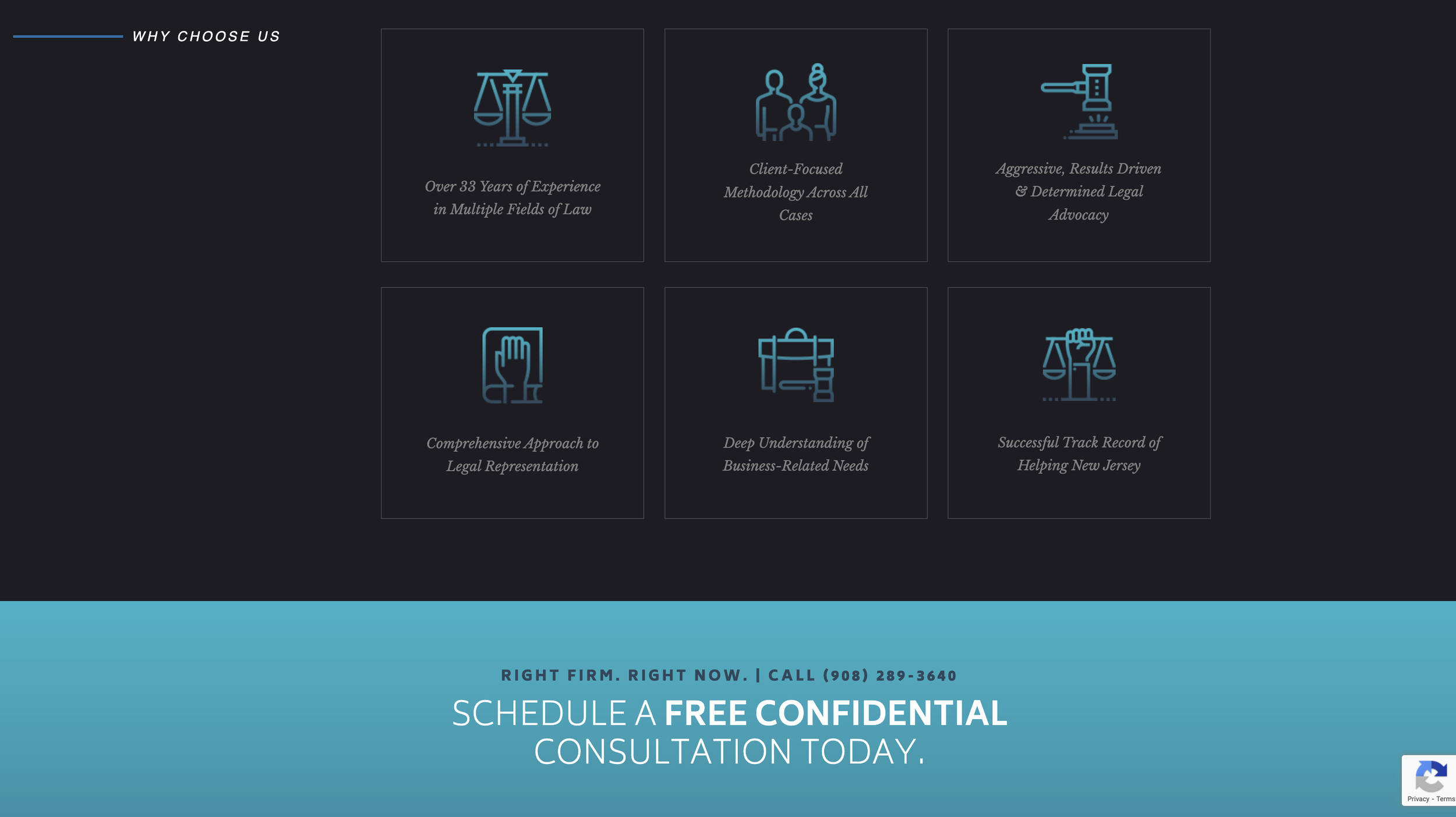
Having a glimpse of all the information available on the homepage;
What information clients expect to be easily accessible;
What specific details clients want to look for.
SITE MAP
After elaborating on the results from the user interviews and the comparative analysis, I drew a general site map to organize better my thoughts on how to get started with design iteration.
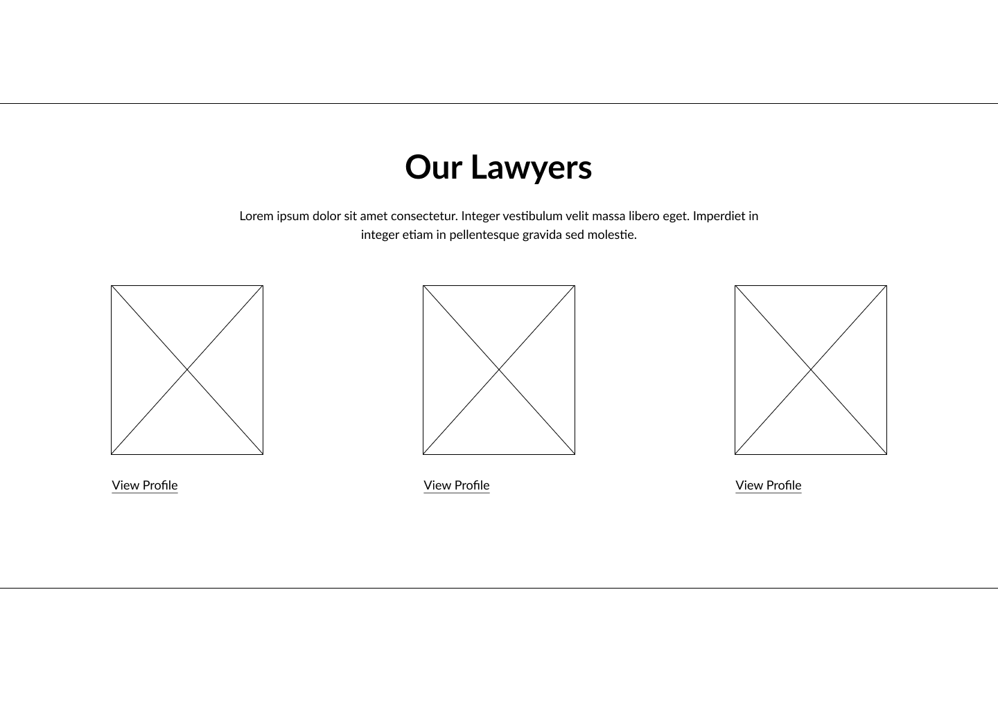
SKETCHING AND WIREFRAMING
Hero Section
Homepage
Details about the firm
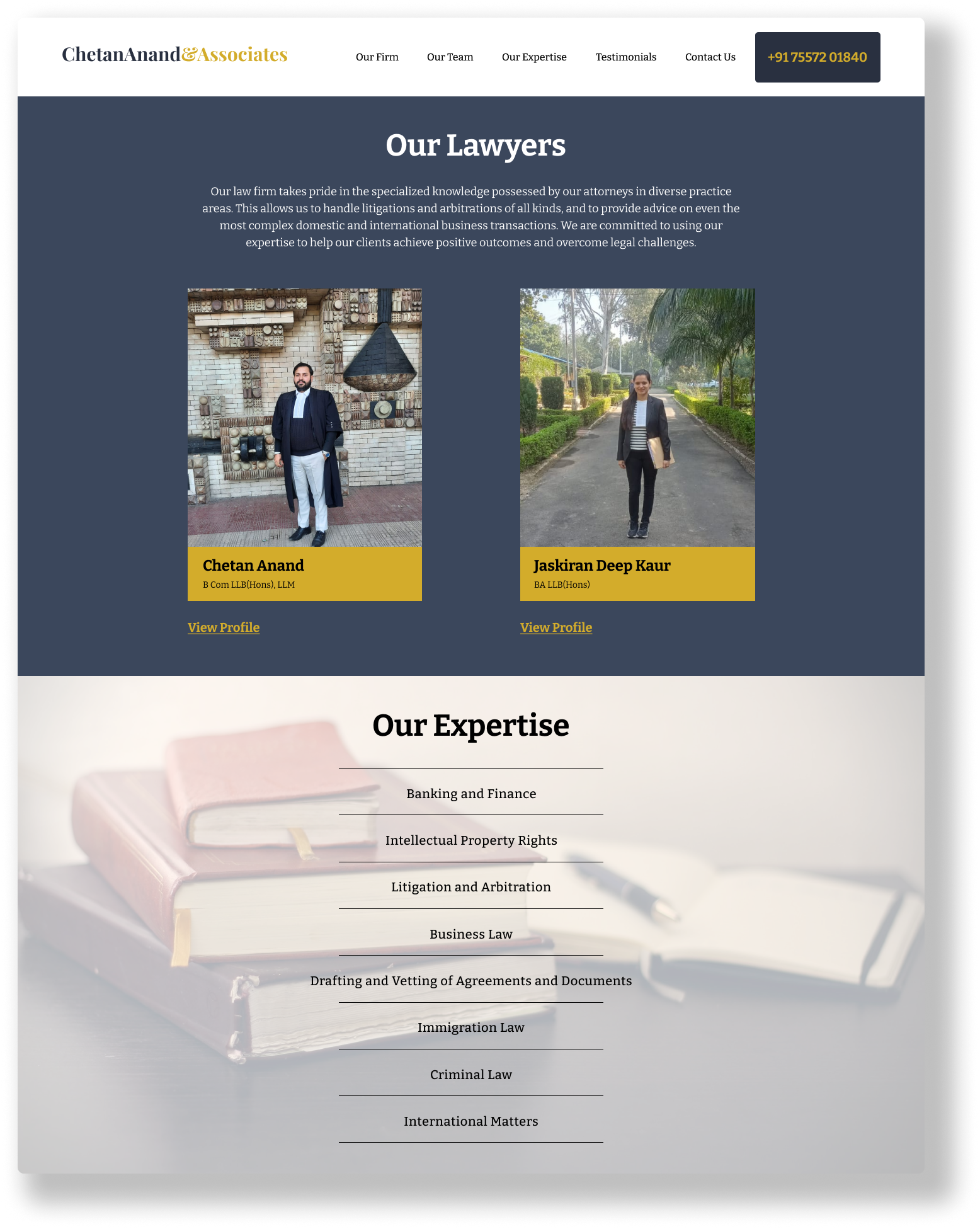
Different areas of practise
List of lawyers
DESIGN SYSTEM UPDATE
Colour Palette Iteration
The neutral beige gives off a natural and organic feeling, while the black and white provide a pop of high contrast that catches a user’s attention.
The soft colour palette promotes calm and peace as well as a sense of professionalism and success.
The slightly muted green against the vibrant blue creates a colour pairing that’s unique and new while keeping that sense of tradition.
These reds give a sense of tradition, power, and professionalism.
On a mostly black-white website, the bright pop of orange color creates interest and emphasizes the most important info on the page (such as the call-to-action buttons).
Thypography Iteration
I spent some time curating a collection of serif typefaces that I felt conveyed a sense of professionalism and seriousness. I was particularly drawn to those with sharp, defined edges, as I felt they added a touch of sophistication to the project.
After client’s feedback and further development, this is the final design system for the new website.
Colour Palette
#293040 Gunmetal
#D3AC2B. Gold metallic
#3B475C Charcoal
#F5F6F7 Anti-flash white
Typography
Wordmark


